Why Do I Need to Design an App Logo?
Whenever Trailhead starts designing an app logo, we believe it’s more than just creating something that looks good. Rather, an app logo should convey your app’s purpose, as well as your company’s values, mission, and personality.
This blog post will take you through Trailhead’s creative process in the context of a mobile app called Trucker Docs. With Trucker Docs, our goal was to create a logo that would resonate with truckers and fleet managers using the app. Through active listening, research, and design iteration, we were able to design an app logo that captures our client’s identity.
When partnering with Trailhead to design anything, including an app logo, you can expect a comprehensive and collaborative process that prioritizes your app’s identity and target audience. Our team works closely with clients to ensure that the logo accurately represents your brand’s mission and values, while also resonating with your intended audience. By using research-driven insights and creative design iteration, we create logos that are not only visually appealing but also effectively communicate the purpose and personality of your app.
Keep reading to learn more about our process and see how it applied to the Trucker Docs project.
Designing an App Logo to Meet Client Needs
When Trailhead started designing Trucker Doc’s app logo, we prioritized understanding their needs, target audience, and brand values. Through extensive communication with their team, we attempted to fully understood Trucker Docs’ app vision and goals. By exploring the day-to-day challenges truckers face, we identified essential features.
Trailhead also considered a broad target audience, including truck drivers, company owners, and fleet managers. Based on these conversations, Trailhead recognized the need to communicate efficient, reliable, and hard-working qualities.
Creating the App Logo Design Brief
Once Trailhead understands the client’s needs, we create a design brief, which is essential to designing an app logo that wows. A design brief is a document that outlines the objectives, goals, and requirements for a design project.
Because Trucker Docs was aiming to provide a streamlined and user-friendly experience while also honoring the trucking industry’s traditions, they want their logo to be as strong and reliable as the truckers of their industry. As a result, they asked for iconic symbols like the eagle and the American flag to represent their dedication to the trucking community.
Trailhead prioritizes client representation and audience appeal in logo design. For Trucker Docs, we crafted a brief aligning with their vision, understanding their challenges and goals. Our approach ensured a logo that met their needs while honoring trucking industry traditions, all in a way that we hope surpasses expectations.
With all of this captured in the design brief, we embarked on app logo design for Trucker Docs, armed with a clear understanding of their needs and expectations.
Research and Inspiration

After creating the design brief, Trailhead conducted thorough research and gathered inspiration for the Trucker Docs’ app logo. We examined industry trends and existing branding to understand Trucker Docs’ visual style and brand identity. The research inspired and informed our design decisions, resulting in an app logo that communicates Trucker Docs’ value proposition. Then, Trailhead combined these insights with our own research and started sketching out potential app logo concepts.
Sketching and Conceptualization
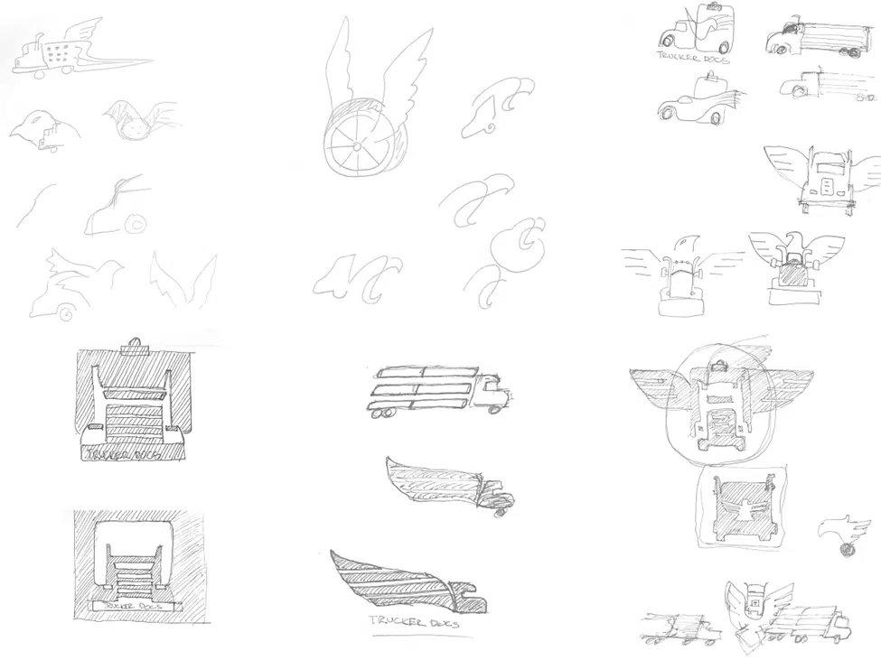
As we moved into the sketching and conceptualization phase of the app logo design process, creativity took center stage. Trailhead drew on the research and inspiration gathered in earlier phases of the process to generate ideas for the logo’s visual identity.
For Trucker Docs, we explored design elements reflecting the app’s key values and American patriotism. Because sketching helps us explore possibilities, we’re more likely to develop concepts that potentially meet the client’s needs. A wide range of concepts are created to ensure the final logo was the best option to represent Trucker Docs’ brand identity and value proposition.
Refining the App Logo Design Concepts

After the sketching and conceptualization phase, Trailhead moves on to the refinement and feedback stage of designing an app logo. We prefer digital tools like Figma to create more polished versions of our sketches.
This is also the point where we start to refine the app logo’s typography and visual elements. This stage is critical for ensuring that the final logo design accurately reflects the client’s vision. During this phase, Trailhead works closely with the client to refine the logo concepts and incorporate their feedback. Through iterating, we’re able to refine our ideas until we arrive at a logo concept that truly captures the brand’s essence.
After the initial concepts have been sketched and developed, our team presents them to the client for review. This is a critical step because it allows the client to see our ideas and provide their feedback. We believe that the client’s input is crucial to the success of the project, so we make sure to listen carefully to all their feedback. From there, we refine the concepts based on the feedback we received. This iterative process continues until we arrive at a final design that makes everyone happy.
We believe that open communication and collaboration are key to designing an app logo. For that reason, we strive to make sure that our clients are involved in the process every step of the way. Skipping this feedback and iteration will greatly decrease the quality of the final result.
Finalization and Delivery
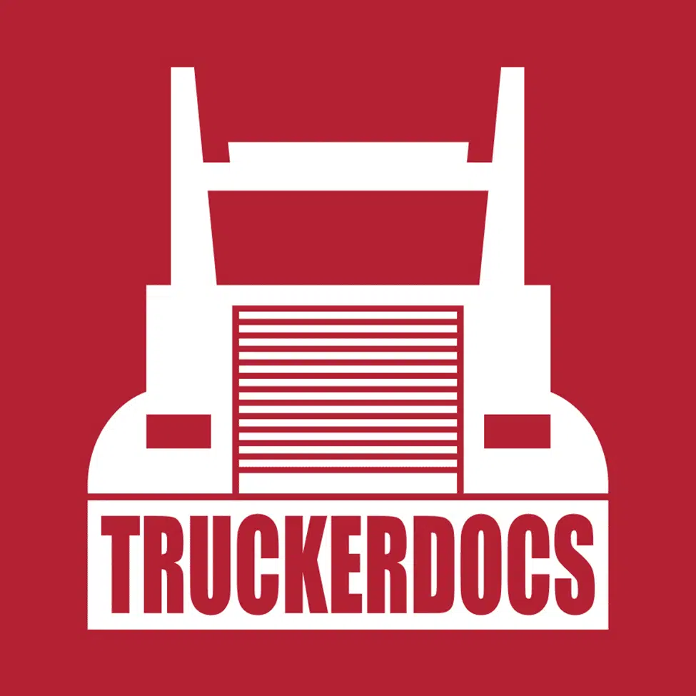
After exploring various options, we decided against incorporating visual elements of the eagle or documents theme into the app logo. Through research and client feedback, we realized these elements might not be recognizable to the app’s target audience. Instead, we chose a simple truck logo that would be easily identifiable to truckers. The logo’s simplicity allows it to convey the app’s purpose and values effectively.
During the finalization and delivery stage of designing an app logo, our team focused on refining the chosen logo and preparing it for use in various applications. This included generating files that are compatible with both Apple’s Human Interface Guidelines as well as Android’s Google Play Icon Guidelines. Trailhead also provided the client with a complete set of logo files and brand guidelines, which outlined how the logo should be used and provided recommendations for typography, color schemes, and imagery.
Overall, our collaboration with the client and decision to opt for a simple truck logo was key to the success of the project. By prioritizing the needs and preferences of the target audience, we were able to create a logo that accurately reflected the brand and resonates with truckers. The final logo design and brand guidelines provided the client with everything they needed to effectively use and promote their brand in the competitive trucking industry.
Conclusion
We embarked on an exciting journey with Trucker Docs to create a logo that reflected their needs, audience, and values. After researching and gathering inspiration from various sources, we sketched and refined multiple concepts, collaborating with the client to ensure their vision was reflected in the final design. We provided the client with various file formats and brand guidelines to ensure the logo was effective across platforms. Our experience with Trucker Docs reinforced to us the importance of active listening, collaboration, and communication in successful logo design.
Of course, you know that Trailhead can help you build your custom software application, but now you also know that we help brand it and design a logo that explain its purpose and attracts its target audience.
We are passionate about creating effective and impactful software, and that includes every detail, including excellent designs that accurately reflect your brand identity.