You’ve heard about responsive web apps (or websites), but did you know you can also make responsive emails, and also make them react to a users’ actions?
To begin, let me show you how the basic HTML email below looks like when it is displayed by various web clients
<html>
<head>
    <meta http-equiv="Content-Type" content="text/html; charset=utf-8" />
    <meta name="viewport" content="width=device-width, initial-scale=1" />
    <meta http-equiv="X-UA-Compatible" content="IE=edge" />
    <style type="text/css"></style>
</head>
<body id="body" style="margin: 0!important; padding:0!important;">
    <div
        style="color:black; font-family: sans-serif;
               font-size: 18px; max-width: 9 00px; text-align: center;
               margin-top: 40px; max-width: 1000px; margin: 0 auto;">
        <!-- Logo -->
        <img src="th_logo.png" alt="Logo" width="400px" style="margin-top:40px;">
        <!-- Headline -->
        <h1 style="text-align: center; font-family: sans-serif;">Title for headline!</h1>
        <!-- Additional image -->
        <img src="marketing_image.jpg" width="1000px" alt="Marketing" style="border-radius: 40px;">
        <!-- Text -->
        <p style="text-align: left; white-space: pre-wrap;">{Lorem ipsum} </p>
        <!-- Link -->
        <a href="/"> Join today by clicking here</a>
    </div>
</body>
</html>
If you take a look at this basic HTML there are a few things you should know about meta tags let’s cover them one by one:
 <meta http-equiv="Content-Type" content="text/html; charset=utf-8" />
 <meta name="viewport" content="width=device-width, initial-scale=1" />
 <meta http-equiv="X-UA-Compatible" content="IE=edge" /> ->
- The first meta tag refers to setting the proper character encoding for the document. In this case it is UTF-8
- The second meta tag is used to set the viewport, or how our device see our email
- The third meta tag is used for Microsoft products to help use with better rendering and compatibility issues
Here is how this email looks when you open it as HTML in a web browser:
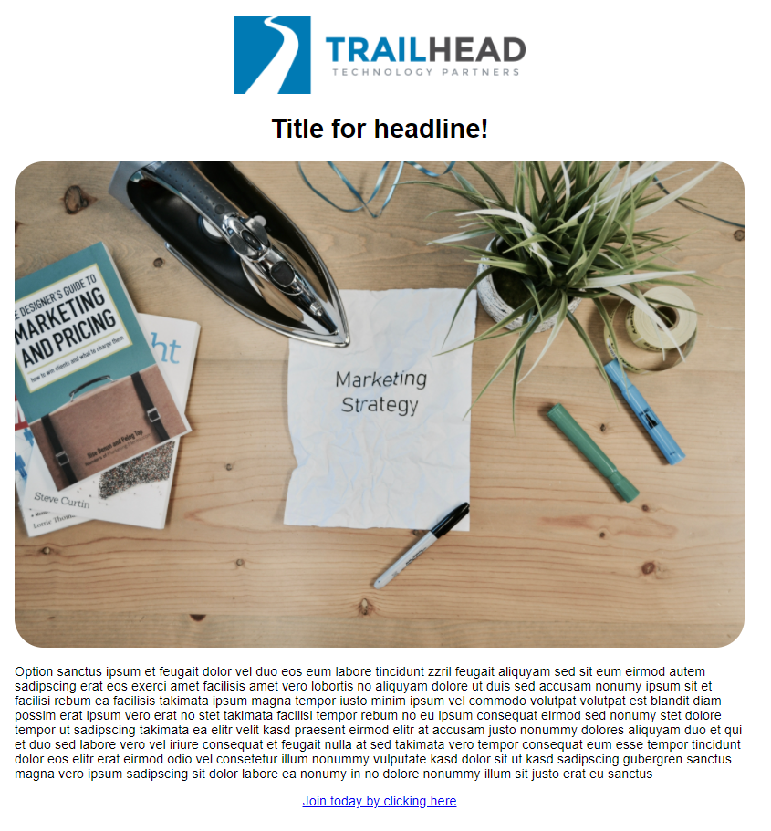


As you can see, results can vary widely. Sometimes they look the same, but sometimes they are way different from each other, even for this very basic email template. For more complex emails this may be even worse.
In the rest of the blog post, I will show you a few tips and tricks with you to help create very nice-looking responsive emails. These could be used for anything such as activation emails, marketing emails, password reset emails, and so on.
Best HTML Tags and CSS to Use
- Structural: table
- Basic: div, spa
- Headings:h1 – h6
- Text: p, strong, em
- Images: img
When it comes to CSS, there are a couple of things you should consider. In standard HTML, we can use CSS styles as:
- Linked stylesheets
- Embedded styles
- Inline styles
- Hybrid CSS (CSS in JS)
However, most web clients do not support linked stylesheets and they stripped these out. Often hybrid CSS is not supported either. That leaves us with just embedded styles and inline styles, but some of the most popular clients also don’t allow embedded syles, so that leaves us with just inline styles if we want to support the widest range of web clients. We can use embedded styles to “reset” the default styles of the web clients.
Links, Buttons, Images, GIFs
When it comes to links, I often stick to a strategy that anything that underlines should be linked and it should be clickable. That strategy is important because most users are used to links looking that way. If I want to put something in the first plan I would often extract it as a button itself.
For buttons I used buttons.cm It is really nice tool for generating bulletproof buttons that are supported by all web apps web clients
<div
><!--[if mso]>
  <v:roundrect xmlns:v="urn:schemas-microsoft-com:vml" xmlns:w="urn:schemas-microsoft-com:office:word" href="www.google.com" style="height:40px;v-text-anchor:middle;width:200px;" arcsize="10%" strokecolor="#1e3650" fillcolor="#f7ecd4">
    <w:anchorlock/>
    <center style="color:#192a14;font-family:sans-serif;font-size:13px;font-weight:bold;">Simple button</center>
  </v:roundrect>
<![endif]--><a href="www.google.com"
style="background-color:#f7ecd4;border:1px solid #1e3650;border-radius:4px;color:#192a14;display:inline-block;font-family:sans-serif;font-size:13px;font-weight:bold;line-height:40px;text-align:center;text-decoration:none;width:200px;-webkit-text-size-adjust:none;mso-hide:all;">Simple button</a>
</div>

Notice that it contains a lot more HTML than your typical button, that’s because it is meant to be supported across all clients. Notice the tag [if mso], since Outlook causes the most problems with rendering, this relies on older technology in that case.
Images
<html lang="en">
    <head>
        <meta http-equiv="Content-Type" content="text/html; charset=utf-8" />
        <meta name="viewport" content="width=device-width, initial-scale=1" />
        <meta http-equiv="X-UA-Compatible" content="IE=edge" />
        <style type="text/css"></style>
    </head>
    <body id="body" style="margin: 0!important; padding:0!important;">
        <div style="color:black; font-family: sans-serif; font-size: 18px; max-width: 9 00px; text-align: center; margin-top: 40px; max-width: 1000px; margin: 0 auto;">
        <img src="hero.jpg" width="600" border="0" style="display:block; max-width:100%; min-width:100px; widht:100%"/>
        <p style="text-align: left; white-space: pre-wrap;">Option sanctus ipsum et feugait dolor vel duo eos eum labore tincidunt zzril pscing sit dolor labore ea nonumy in no dolore nonummy illum sit justo erat eu sanctus </p>
        </div>
    </body>
</html>
Layout
<table border="0" cellpadding="0" cellspacing="0" role="presentation" width="100%">
  <tr>
    <td styles=""></td>
  </tr>
</table>
<html lang="en">
  <head>
    <meta http-equiv="Content-Type" content="text/html; charset=utf-8" />
    <meta name="viewport" content="width=device-width, initial-scale=1">
    <meta http-equiv="X-UA-Compatible" content="IE=edge" />
  </head>
  <body id="body" style="margin: 0 !important; padding: 0 !important;">
    <table border="0" cellpadding="0" cellspacing="0" role="presentation" width="100%">
      <tr>
        <td align="center">
          <table border="0" class="mobile" cellpadding="0" cellspacing="0" role="presentation" width="600" style="background-color: #ffffff; color: #000000; font-family: sans-serif; font-size: 18px; line-height: 36px; margin: 0; padding: 0;">
            <!-- Logo image -->
            <tr>
              <td align="center" style="padding: 20px;">
                <img src="th_logo.png" alt="Logo" width="400px" style="margin-top:40px;">
              </td>
            </tr>
            <!-- Headline -->
            <tr>
              <td style="padding: 20px;">
                <h1 style="margin: 0; font-size: 32px; text-align: center;">Title for headline!</h1>
              </td>
            </tr>
                        <!-- Additional image -->
                        <tr>
              <td align="center" style="padding: 20px;">
                <img src="marketing_image.jpg" alt="Logo" width="600px" style="margin-top:40px;">
              </td>
            </tr>
            <!-- Text -->
            <tr>
              <td style="padding: 20px;">
                                <p style="text-align: left; white-space: pre-wrap;">Option sanctus ipsum et feugait dolor vel duo eos eum labore tincidunt zzril feugait aliquyam sed sit eum eirmod autem sadipscing erat eos exerci amet facilisis amet vero lobortis no aliquyam dolore ut duis sed accusam nonumy ipsum sit et facilisi rebum ea facilisis takimata ipsum magna tempor iusto minim ipsum vel commodo volutpat volutpat est blandit diam possim erat ipsum vero erat no stet takimata facilisi tempor rebum no eu ipsum consequat eirmod sed nonumy stet dolore in no dolore nonummy illum sit justo erat eu sanctus </p>
              </td>
            </tr>
            <!-- Button -->
            <tr>
              <td style="padding: 20px 0 60px 0;">
                <!-- CTA generated by buttons.com -->
                <div style="text-align: center;">
                  <!--[if mso]>
                  <v:roundrect xmlns:v="urn:schemas-microsoft-com:vml" xmlns:w="urn:schemas-microsoft-com:office:word" href="/" style="height:60px;v-text-anchor:middle;width:310px;" arcsize="7%" stroke="f" fillcolor="#229efd">
                    <w:anchorlock/>
                    <center>
                  <![endif]-->
                    <a class="button" href="/" style="background-color:#229efd;border-radius:4px;color:#ffffff;display:inline-block;font-family:sans-serif;font-size:18px;font-weight:bold;line-height:60px;text-align:center;text-decoration:none;width:310px;-webkit-text-size-adjust:none;">Join today by clicking here</a>
                  <!--[if mso]>
                    </center>
                  </v:roundrect>
                  <![endif]-->
                </div>
              </td>
            </tr>
          </table>
        </td>
      </tr>
    </table>
  </body>
</html>
Helpful Tools
- MJML: Mailjet Markup Language
- Maizzle email framework
- Tota11y accessibility tool
- Mailchimp CSS inliner
- Bulletproof Buttons generator
Wrapping up
Here I showed you a simple but effective way of writing responsive emails. Happy coding!


