Modern UIs often need elements that float above the rest of the page, such as modals, tooltips, popovers, or notifications. But when you try to build these inside your component hierarchy, you quickly hit frustrating limits like overflow clipping, stacking issues, and unpredictable z-index behavior.
In this blog, I will show you how to use React.createPortal to solve these problems by rendering elements outside the normal DOM tree while keeping them fully connected to your React app.
What is React.createPortal?
React.createPortal (syntax React.createPortal(children, container)) is a feature that lets you to render React elements into a DOM node that exists outside the parent’s DOM tree. It allows you to keep your UI where it belongs: in the React tree logically, but in the DOM exactly where it needs to be. The children are still part of the React component hierarchy (they receive context, props, and updates), but in the actual DOM they’re mounted somewhere else.
Basic example:
import React from "react";
import ReactDOM from "react-dom";

function Modal({ children }) {
   return ReactDOM.createPortal(
	   <div className="modal">{children}</div>,
	   document.body
   );
}
Here, even if <Modal> is rendered deep in your component tree, its DOM nodes appear just before closing </body> tag. React takes on all the job to add the element to DOM and remove it from proper place of DOM after element is unmounted. This solves problems with stacking, clipping, and positioning that CSS alone cannot handle reliably. Essentially we render our element above all mounted React application and can apply any placement we want. Also it possible to define a particular places to render target element.
Setting Up Named Portals
A good practice is to define multiple “portal roots” in your index.html to organize different kinds of overlays. You can use them as a destination to render every particular sort of floating UI elements. Technically it just unique-named DOM elements in .html file along with root DOM element where the main app is being mounted.
Example index.html
<body>
	<div id="root"></div>
	<!-- Named portal targets -->
	<div id="modal-root"></div>
	<div id="tooltip-root"></div>
	<div id="notification-root"></div>
</body>
Example Components
import React from "react";
import ReactDOM from "react-dom";

export function Modal({ children }) {
	return ReactDOM.createPortal(
		<div className="modal">{children}</div>,
		document.getElementById("modal-root")
	);
}

export function Tooltip({ children }) {
	return ReactDOM.createPortal(
		<div className="tooltip">{children}</div>,
		document.getElementById("tooltip-root")
	);
}

export function Notification({ message }) {
	return ReactDOM.createPortal(
		<div className="notification">{message}</div>,
		document.getElementById("notification-root")
	);
}
This way, your DOM stays clean and responsibilities clear: modals in #modal-root, tooltips in #tooltip-root, and so on. It is not a strictly required practice, rather a useful and convenient way to organize the markup.
UI Cases for Custom Mounting Via React.createPortal
The obvious solution for such rendering is just to add absolutely position the element with a high z-index without any magic with native React feature. The issue is that CSS alone can’t overcome parent boundaries.
The main and most painful one is Overflow Clipping. If a parent has overflow: hidden or overflow: auto, absolutely positioned children will still be cut off. Portals avoid this by moving the element outside of the clipping container.
With pure CSS it can look like
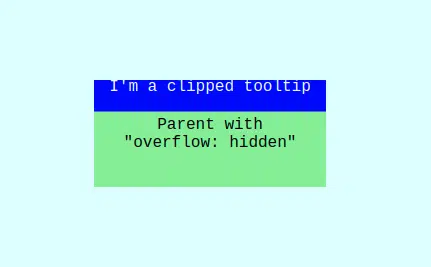
When we place floating element to the root DOM element we can apply its placement relatively to the whole document (it needs some calculations, of course). For several particular cases it provides a silver bullet to resolve clipping issue when avoiding overflow parent boundaries is impossible.
The other benefits are:
- Z-Index Limitations – Z-index only works within stacking contexts. If a parent has its own stacking context, it might prevent your modal or tooltip from rising above other UI elements.
- Isolation – with absolute positioning, your component is still “tied” to its parent’s DOM. Styles can cascade down unexpectedly. Portals isolate overlays in dedicated containers.
- Predictability – a tooltip placed in a deeply nested component tree may require awkward position calculations. With portals, you can anchor it to the document and calculate positions relative to target elements more easily.
So general conclusion is simple – we can use position: absolute for local UI tweaks and portals – when the element must escape the layout or stacking context entirely.
Adding Positioning: Example with a Modal
Imagine we want to have a modal to appear next to a button or a tile, but the layout has scrollable containers with overflow: hidden.
Here’s how you can handle positioning:
import React, { useEffect, useState } from "react";
import ReactDOM from "react-dom";

export function Modal({ targetRef, children }) {
   const [pos, setPos] = useState({ top: 0, left: 0 });

   useLayoutEffect(() => {
	if (targetRef.current) {
		const rect = targetRef.current.getBoundingClientRect();
		setPos({
		   top: rect.bottom + window.scrollY + 8,
		   left: rect.left + window.scrollX,
		});
	}
   }, [targetRef]);

   return ReactDOM.createPortal(
	<div
		className="modal"
		style={{
			position: "absolute",
			top: pos.top,
			left: pos.left,
			}}>
			{children}
	</div>,
	document.body
   );
}
Usage:
function App() {
   const buttonRef = React.useRef(null);
   return (
	   <div>
		   <button ref={buttonRef}>Hover me</button>
		   <Modal targetRef={buttonRef}>Modal content</Tooltip>
	   </div>
  );
}
Here:
- The tooltip is positioned relative to the button using
getBoundingClientRect(). - Even if the button is inside a scrollable container, the tooltip renders in document body, avoiding clipping.
!NB:
- use native React hook useLayoutEffect – it will do calculations when position of element is known but before element be displayed on the screen. After calculations it will set the state, which cause re-render of the component but with the right positioning. It prevents blinking and other not desirable visual pitfalls
- if you have to use some params from previous state, don’t do like this:
// Don't

useLayoutEffect(() => {
	const positions = {
		...
	};
	setSomeState((prevState) => {
		return {
			...prevState,
			...positions
		};
	});
}, []);
That will break rendering cycle and not desirable visual pitfalls will occur
// Do this instead

useLayoutEffect(() => {
	const positions = {
		// variable, that represents previous state
		...someState,
		// any additional params
	};
	setSomeState(positions);
}, []);
Common Pitfalls
- Event Bubbling Confusion – React events bubble through the component tree, not the DOM tree. This may confuse debugging
- Accessibility Gaps – portals don’t provide focus traps, keyboard navigation, or ARIA roles. For common cases modals, use regular UI libraries, or take care about them by your own
- Multiple Roots Chaos – if you create too many portal roots without documentation, maintainability suffers
- Server-Side Rendering (SSR) – if portal containers (
#modal-root, etc.) don’t exist on the client, you’ll hit hydration mismatches. Always ensure they’re present inindex.html
Conclusions
React.createPortal solves real-world problems that CSS can’t fix and manage alone: clipping, stacking context conflicts, and layout unpredictability. Using portals has several pros and cons:
Best Use Cases for Portals:
- Custom modals and dialogs which must appear above all other UI
- Prevention of clipping and allow flexible positioning of tooltips and popovers
- Setting of global messages which need their own UI layer
- Managing of right-click or floating context menus which benefit from isolation.
When to Avoid Portals:
- If CSS fixes suffice then don’t over-engineer
- For small, local UI or effects like badges, dropdowns or progress bars inside a card
- In performance-critical scenarios – too many scattered portals can complicate rendering and debugging.
If you are building complex user interfaces in React and want to avoid layout and clipping issues, Trailhead can help. Our team has deep experience solving real-world UI challenges with React, .NET, and modern cloud platforms. Contact us to learn how we can help you design clean, scalable front-end architectures that work seamlessly with your existing systems.