When I started to look at the Flutter framework as a powerful and flexible tool for cross-platform mobile development, I was pretty fascinated with the idea of transforming a Flutter mobile app into a web application.
To test it out, I decided to convert an existing Flutter mobile app into a web app. My main goal was to see how easy such a conversion could be and how the resulting web app would look and function. I also wondered what efforts it would take for me to transform the screen designed for mobile into widescreen desktop views in several resolutions and what parts might be the most challenging.
Transformation of the Flutter Application
It turned out to be really easy to convert the mobile app to a web one—you’ll need only one terminal command:
flutter build web That CLI command creates a ‘build’ folder inside your project folder and a ’web’ folder inside of that. The web folder contains all the assets, icons, and other files for your web application, including the index.html file and all the JS bundles as one file so it looks just like a regular JavaScript project. It is possible to split the bundle into several files to reduce their size, but that is out of the scope of this blog.
I used the Live Server plugin for VS Code as the laziest way to view the web app up and running using a simple web server. Of course, we can also create a simple NodeJS server (with any framework you like), or use NGINX or the Apache web server or any other web server you prefer.

The first thing you’ll want to note is to make sure you adjust the <base href=””> tag in the generated index.html file to define the correct path for your generated JS bundle. By default, the build command created it as <base href=”/”>, and in my case, I needed to change it to <base href=”./”> to point to the same folder. Your situation may be different.

Main points of transformation of Flutter mobile app to web application
I was faced with several challenges to deal with while converting the app. They were:
- Plugin compatibility between mobile and web
- Different mobile and web routing models
- Adjustive mobile UIs to a wider screen
- Mobile/web-specific events
Let’s go through each of them one by one so you can see how I addressed each.
Plugin Compatability
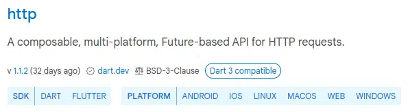
Before conversion, we should check all the plugins installed in the mobile application to make sure they are compatible with the web. You can check the online at https://pub.dev. This resource is the official package repository for Dart and Flutter applications. Every package/plugin contains a list of the platforms on which it will work. The most likely pitfall here is the situation where an installed package works on mobile but does not support the web, and we have to replace it and make and changes that requires to the app code.
Routing
There are two possible implementations of routing architecture in a Flutter application—named routing and stack routing.
Named routing works very similarly to routing in any common web framework/library. Stack routing more closely matches user navigation in mobile apps—users can walk though an app’s pages only sequentially, and when the user clicks the ‘Back’ button. the app navigates to the previous page. So that means that any page the user navigates to will be added to a stack or screens, layer on layer.
Routing in web applications requires only named routing. There is no way to navigate to a specific page in a mobile app just by using a link address, but it is a common practice for web applications. Therefore, if the existing mobile app has stack routing implemented, it will require you to change it to named routing throughout the codebase.

This issue appears to be the most time-consuming part of the transformation. Flutter provides a built-in system for navigating known as the Navigator widget, which works pretty well. At the same time the community and tutorials usually highly recommend that you use custom packages for navigation, such as the popular Beamer package. Implementation of a custom package requires a lot of work to refactor an existing app, but if yours implements stack routing, you will have to do it anyway to meet web routing requirements, so you might want to consider it.
Responsive UIs
The layout of most mobile applications is not as complicated as web ones can be. Wider screens allow you to implement more complex multi-column and multi-block designs and to provide complex UI with a greater number of features. So the task of transforming a simple, mobile layout to a different web-friendly view can be a real challenge.
There is a high probability that you will have to rebuild all your the pages of the existing application. The goal is to implement conditional block rendering based on break-points of different resolutions, thus providing different UIs for different-sized screens. Most likely you will need to use a custom layout widget such as the LayoutBuilder. Keep in mind that every custom package you add may require code refactoring.
Browser- and Web-Specific Events
Some elements have behavior that is invoked by mouse events. For example, changing the hover state depends on mouse pointer placement, which doesn’t make any sense in a mobile app, since you cannot hover a cursor on a mobile screen that uses touch.
Another similar thing happens when your app needs to react to keyboard events or when a particular key is pressed. This only makes sense for web development.
To enhance your web version of a Flutter mobile app, you should consider using widgets that are for this purpose. For example, the Shortcuts widget listens for process-specific keyboard actions and the MouseRegion widget tracks mouse movements. Again, all these changes may require refactoring particular places of your codebase.
Conclusion and Summary
In conclusion, for a smoother transition and efficient development, it’s advisable to plan for mobile-to-web conversion from the project’s inception. Prioritizing scalability and flexibility is crucial. Converting an existing mobile app to a web version might not be a straightforward task, and challenges may arise, especially when there’s a disparity in expectations regarding UI/UX complexity between the two platforms.
Additionally, potential future differences in web and mobile design concepts could render the web adaptation redundant. Moreover, adapting to the web may inadvertently result in an unnecessarily bloated codebase. Therefore, the decision to transform is most sensible when both the mobile and web versions are anticipated to share similar UI and functionality.