When we want to reuse some of our user interface elements in a Xamarin.Forms application, one of the best ways to do it is by using custom controls.
In this Github repository, I created a sample application with a custom control that is a composite of two other controls. I’ll use this example to show you how easy is to implement and use it. This sample application is a standard Xamarin.Forms app with a shared project and the two platform projects–one for iOS and one for Andriod.
In the following screenshot, we can see two instances of the custom control, which is a composite control allowing the user to pick both a date and a time. It exposes bindable properties for the caption and the selected DateTime value.

Custom Control Definition
The visible part of our control is defined in the CustomDateTimePicker.xaml file. In the code-behind file, we define its functionality.
In the XAML file for your custom control, you can use any of the existing Xamarin.Forms controls or other custom controls previously defined.
To create bindable properties, we need a static public property of type BindableProperty, like in the following definition of the Caption property.
public static readonly BindableProperty CaptionProperty = BindableProperty.Create(
   "Caption",
   typeof(string),
   typeof(CustomDateTimePicker),
   "");
public string Caption
{
   get => (string)GetValue(CaptionProperty);
   set => SetValue(CaptionProperty, value);
}
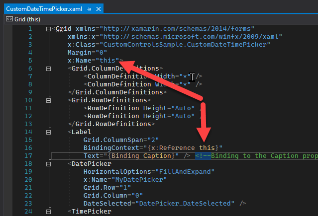
To avoid a possible collision with an existing property called Caption, in any view-model where the custom control is used, we set an internal name for our control (the “this” name in line 4) and then use that name to create a reference for the binding context holding the bindable property
Regarding the SelectedDateTimeProperty, you can check the OnPropertyChanged code to see how the date and time pickers get their values, and the DatePicker_DateSelected and TimePicker_PropertyChanged events handlers are used for the property getting the value.
Using a Custom Control
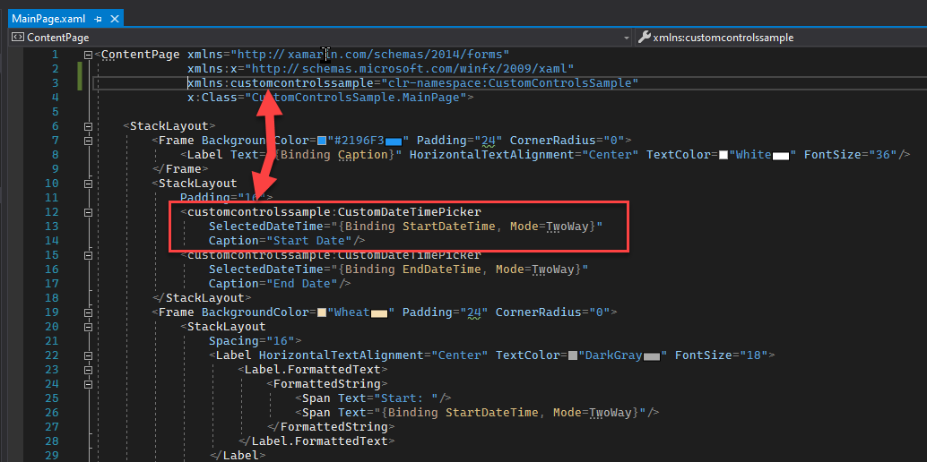
To use our new custom control, we will add a tag to MainPage.xaml by using the tag name “CustomDateTimePicker”. We need to add a reference to the namespace where our control is defined (ex: CustomControlSample), and to set the properties as shown in the following screenshot.
Notice that we have two instances of our control in the same view. The Caption property is set to a literal and the SelectedDateTime to a bindable property of the view-model.
And that’s it! We’ve now created a simple custom control which is a composite of two other controls.
Check out the full project here. I hope this was useful for you and please drop a line if you have any questions or comments.